This comprehensive guide covers all aspects of the Theming functionality, from basic usage to advanced features and technical details.
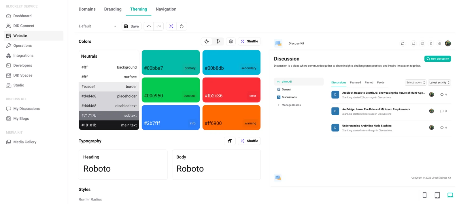
Header Section
Theme Management
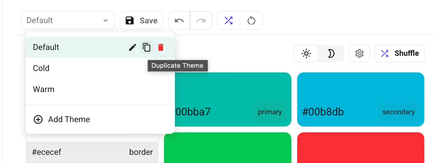
- Switch Themes: Quickly switch between different theme configurations
- Add Theme: Start with a fresh theme configuration
- Duplicate Theme: Make a copy of the current theme configuration
- Rename Theme: Change the name of your theme
- Delete Theme: Permanently remove this theme
- Save Theme: Save current theme settings with a single click
Undo/Redo System
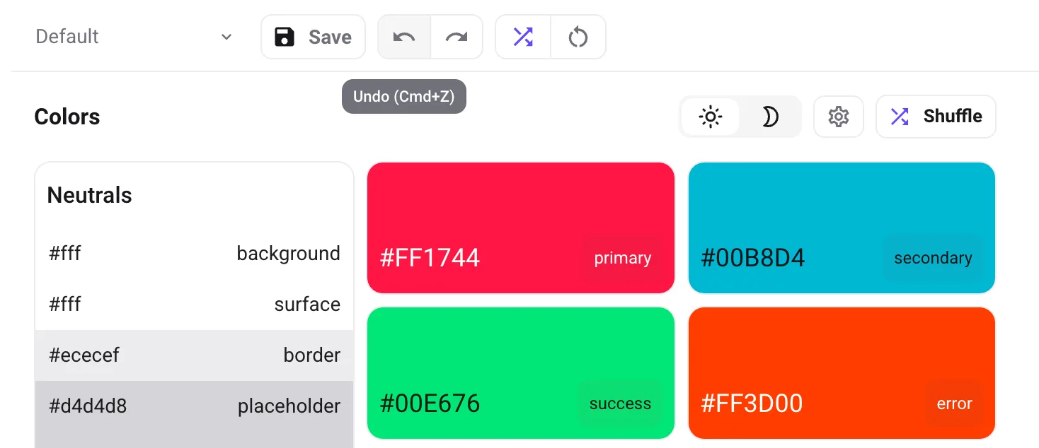
- Undo Button: Revert the last change made to the theme
Ctrl/Cmd + Z - Redo Button: Restore a previously undone change
Ctrl/Cmd + Shift + Y - History Tracking: Keeps a record of your most recent 50 changes
Random Theme Generator
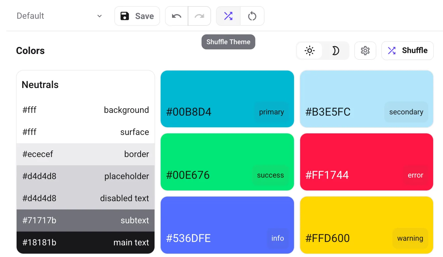
- Shuffle Button: Generate a completely new theme with random colors and fonts
- Smart Randomization: Ensures generated themes maintain good contrast and readability
Reset Theme
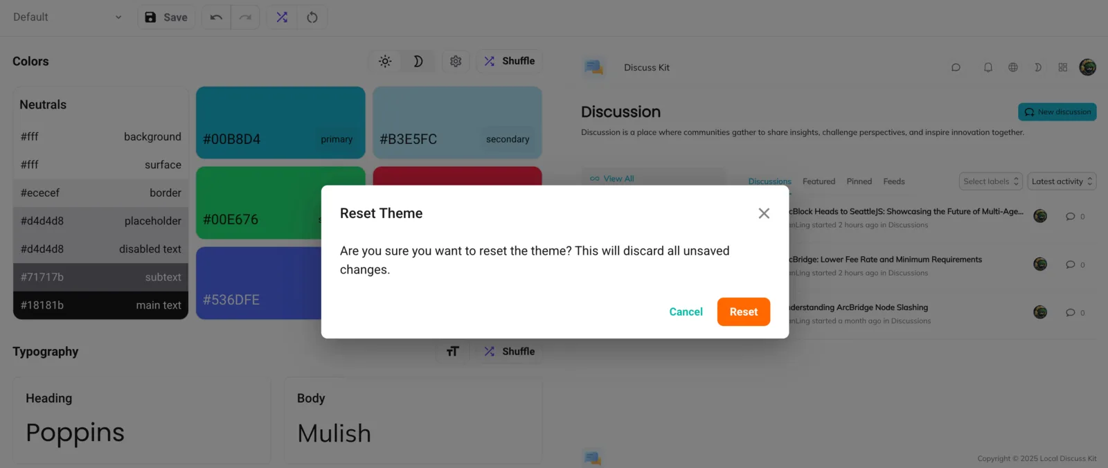
- Reset Button: Return to default theme settings
- Confirmation Dialog: Prevents accidental resets
- Selective Reset: Reset only the current theme without affecting others
Colors Section
Light/Dark Mode Toggle
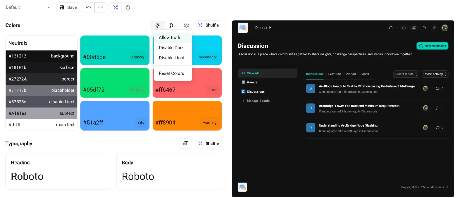
- Mode Switching: Toggle between light and dark themes
- Mode Disabling: Option to disable specific modes based on concept preferences
- Visual Indicators: Clear indication of which mode is active or disabled
Color Palette Management
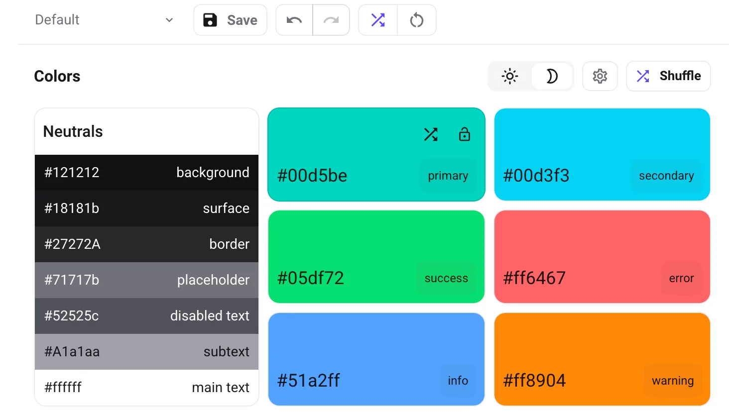
- Primary Colors: Main brand colors for buttons, links, and highlights
- Secondary Colors: Complementary colors for surfaces, accents, and UI elements
- Neutral Colors: Grays and whites for backgrounds, borders, and typography
- Semantic Colors: Status colors like success, warning, error, and info for messages and states
Random Color Generation
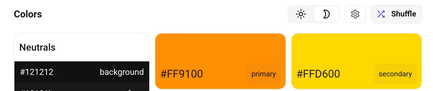
- Smart Shuffle: Generates harmonious color combinations
- Contrast Preservation: Ensures generated colors maintain accessibility standards
- Brand Consistency: Option to lock specific brand colors during shuffling
Typography Section
Font Family Selection
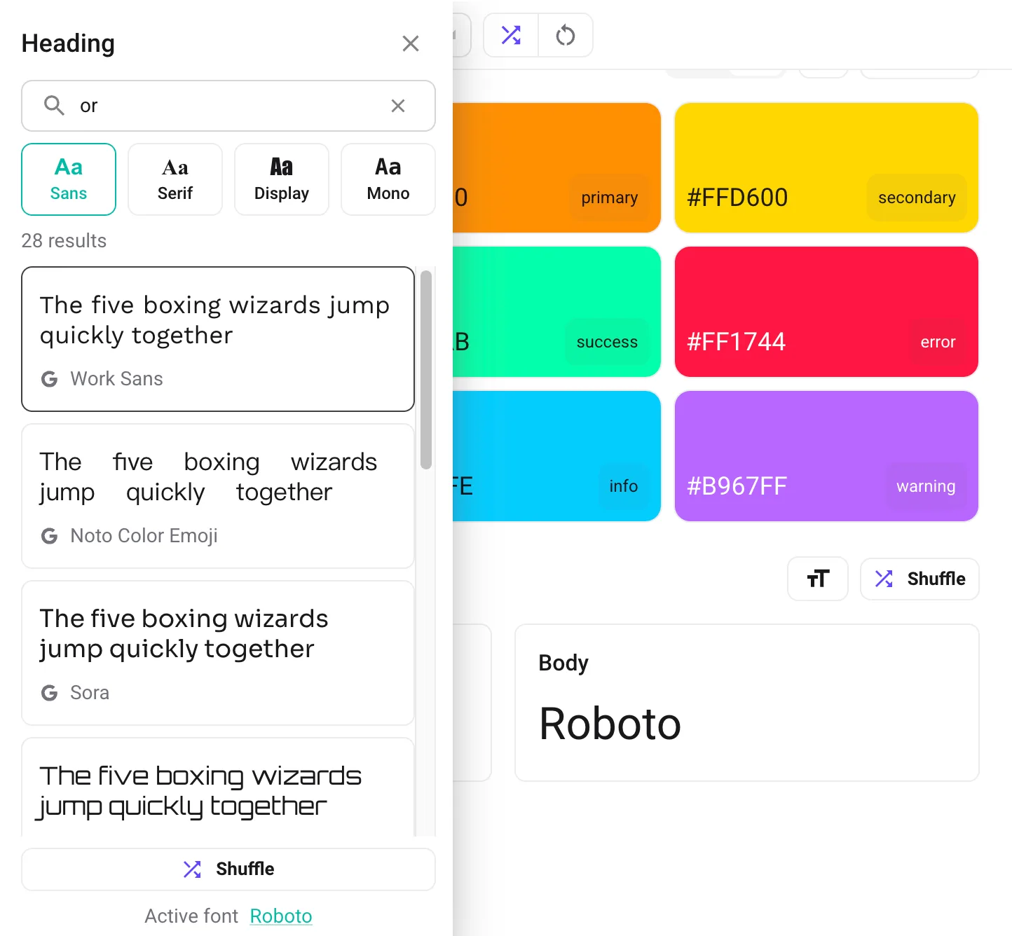
- Heading Fonts: Font selection for all heading elements (H1, H2, H3, etc.)
- Body Fonts: Font selection for body text and paragraphs
- Google Fonts Integration: Access to thousands of Google Fonts
- Font Preview: Live preview of how fonts will appear
- Font Categories: Organized by style (serif, sans-serif, display, etc.)
Font Size Controls
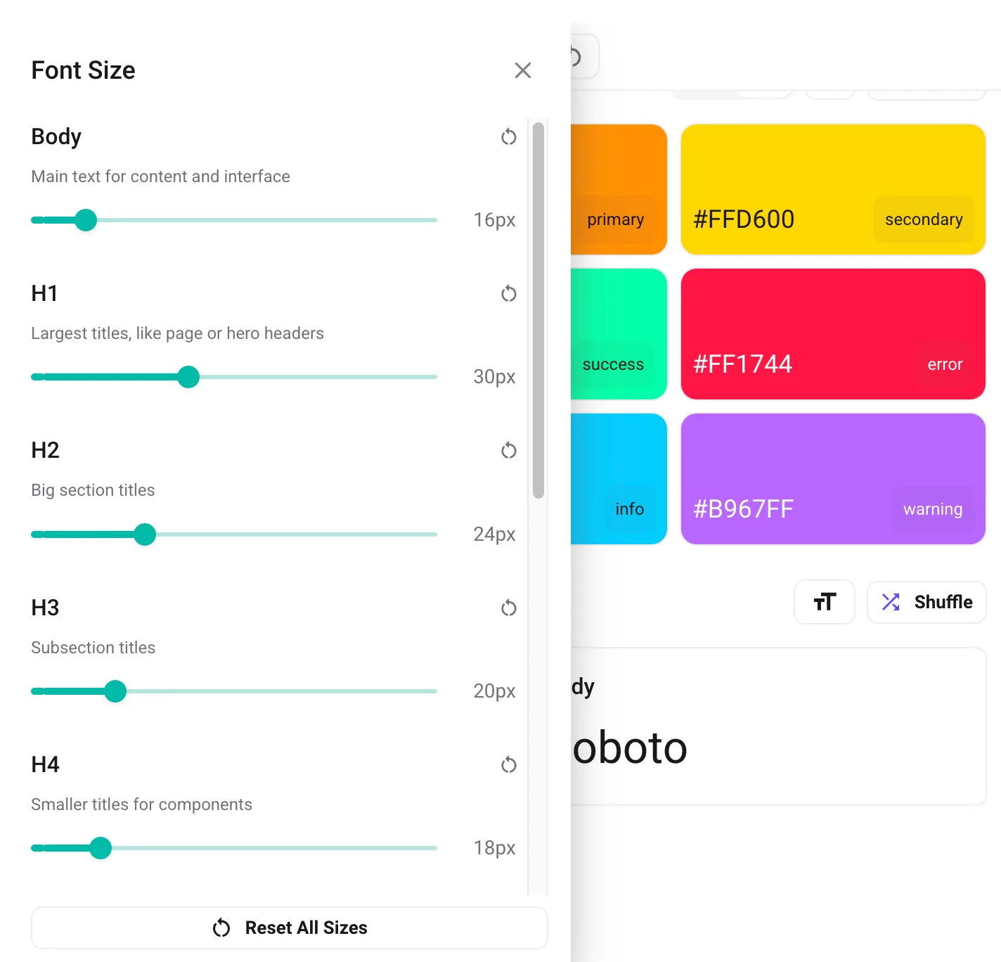
- Global Font Size Scale: Define the base font size to control the overall typography scale
- Custom Sizes: Customize font sizes for individual variants in the theme
Random Font Generation
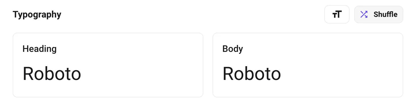
- Font Pairing: Smart selection of complementary font combinations
- Style Matching: Ensures fonts match the overall design aesthetic
- Performance Consideration: Prioritizes fast-loading fonts
Styles Section
Border Radius Control
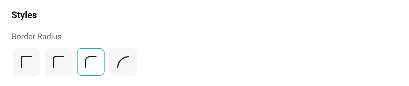
- Global Border Radius: Set the default corner radius for components (
shape.borderRadius)
Preview Section
Real-time Preview
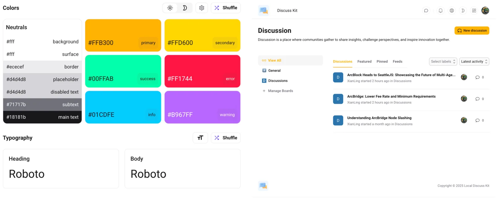
- Blocklet Integration: Real-time preview of actual applications
- Instant Updates: All changes reflected immediately in the preview
Responsive Preview
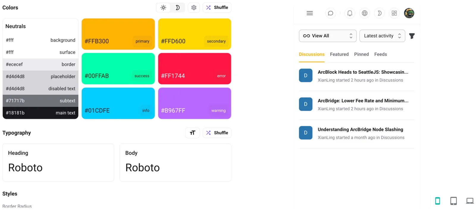
- Screen Size Simulation: Test theme on different device sizes
- Mobile Preview: Optimized mobile layout testing
- Tablet Preview: Tablet-specific layout verification
- Desktop Preview: Full desktop layout testing