This document provides a detailed guide to implementing the CheckoutDonate component, a flexible solution for adding donation functionality to your application. By following these steps, you will learn how to configure the component, set up the required providers, and utilize its various display modes to create a seamless donation experience.
The CheckoutDonate component is designed to be highly customizable, supporting everything from a simple donation button to a fully bespoke user interface. It must be wrapped within both a PaymentProvider and a DonateProvider to manage state and connect to the payment backend.
Provider Setup
Correctly setting up the PaymentProvider and DonateProvider is a prerequisite for using CheckoutDonate. The PaymentProvider handles the connection to the payment service, while the DonateProvider manages the configuration and state for donation instances within a specific part of your application.
The following diagram illustrates how these providers wrap the CheckoutDonate component and interact with the payment backend and your application's session context.
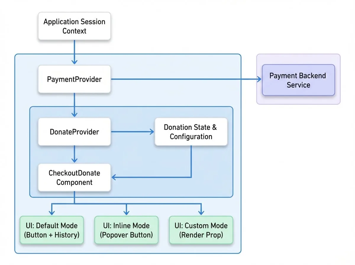
The example below demonstrates the required provider structure. The DonateProvider is configured with a unique mountLocation to distinguish this donation context from others in your application.
ProviderSetup.jsx
import {
  PaymentProvider,
  DonateProvider,
  CheckoutDonate,
} from '@blocklet/payment-react';
import { useSessionContext } from '../hooks/session-context'; // This is your app's session context hook

function DonationSection() {
  const { session, connectApi } = useSessionContext();

  if (!session) {
    return <div>Loading session...</div>;
  }

  return (
    <PaymentProvider session={session} connectApi={connectApi}>
      <DonateProvider
        mountLocation="blog-post-donations"
        description="Handles all donations for blog posts"
        defaultSettings={{
          btnText: 'Support Me',
          historyType: 'avatar',
        }}>
        <CheckoutDonate
          settings={{
            target: 'post-123',
            title: 'Support the Author',
            description: 'If you found this article helpful, consider a small donation.',
            reference: 'https://example.com/posts/123',
            beneficiaries: [
              {
                address: 'z2qa...gCLd', // Author's DID address
                share: '100',
              },
            ],
          }}
        />
      </DonateProvider>
    </PaymentProvider>
  );
}
For a more in-depth explanation of its props and functionality, please refer to the DonateProvider documentation.
Component Props
The CheckoutDonate component accepts several props to control its behavior and appearance.
- settings
CheckoutDonateSettings(required) — Configuration object for this specific donation instance. See the CheckoutDonateSettings section below for details. - onPaid
(session: TCheckoutSessionExpanded) => void— Callback function executed after a successful donation. It receives the checkout session details as an argument. - onError
(error: Error) => void— Callback function executed if an error occurs during the payment process. - mode
'default' | 'inline' | 'custom'(default:default) — Specifies the rendering mode. 'default' shows a button and supporter list. 'inline' shows a button that opens a popover. 'custom' uses a render prop for a completely custom UI. - inlineOptions
object— Configuration options specific to the 'inline' mode.- button
ButtonType— Custom properties for the inline button, such as text and icon.
- button
- livemode
boolean— Overrides the livemode setting from PaymentProvider. Set to true for live transactions or false for test transactions. - timeout
number(default:5000) — The delay in milliseconds before the donation dialog closes automatically after a successful payment. - theme
'default' | 'inherit' | PaymentThemeOptions(default:default) — Controls the component's styling. See the Theming guide for more information. - children
function— A render prop function used only when mode is set to 'custom'. See the Custom UI Mode example for the function signature.
CheckoutDonateSettings
This object is passed to the settings prop and defines the core details of the donation target.
- target
string(required) — A unique identifier for the donation target, such as a post ID or project name. This is used to group donations. - title
string(required) — The title displayed at the top of the donation dialog. - description
string(required) — A brief description of the donation's purpose, shown in the dialog. - reference
string(required) — A URL related to the donation target, used for record-keeping and context. - beneficiaries
PaymentBeneficiary[](required) — An array of objects defining the fund recipients. Each object must include an address (recipient's DID) and a share (percentage). - amount
object— Configures the donation amounts. If not provided, it falls back to settings from DonateProvider or a system default.- presets
string[]— An array of suggested donation amounts (e.g., ['1', '5', '10']). - preset
string— The default selected amount from the presets. - minimum
string— The minimum allowed donation amount. - maximum
string— The maximum allowed donation amount. - custom
boolean— Determines if users can enter a custom donation amount.
- presets
- appearance
object— Customizes the component's visual elements.- button
object— Customizes the donation button'stext,icon,size,color, andvariant. - history
object— Configures the appearance of the supporter history list. Setvariantto 'avatar' or 'table'.
- button
Usage Examples
Default Mode
The default mode is the most straightforward implementation. It renders a donation button and a list of recent supporters. Clicking the button opens a dialog where the user can complete the donation.
DefaultMode.jsx
import {
  PaymentProvider,
  DonateProvider,
  CheckoutDonate,
} from '@blocklet/payment-react';
import { useSessionContext } from '../hooks/session-context';

function App() {
  const { session, connectApi } = useSessionContext();

  if (!session) {
    return <div>Loading session...</div>;
  }

  return (
    <PaymentProvider session={session} connectApi={connectApi}>
      <DonateProvider
        mountLocation="blog-post-donations"
        description="Donations for the main blog"
        defaultSettings={{
          btnText: 'Buy me a coffee',
          historyType: 'avatar',
        }}>
        <CheckoutDonate
          settings={{
            target: 'post-123',
            title: 'Support the Author',
            description: 'If you found this article helpful, consider a small donation.',
            reference: 'https://example.com/posts/123',
            beneficiaries: [
              {
                address: 'z2qa...gCLd', // Author's DID address
                share: '100',
              },
            ],
          }}
          onPaid={() => {
            alert('Thank you for your donation!');
          }}
        />
      </DonateProvider>
    </PaymentProvider>
  );
}
Custom UI Mode
For complete control over the layout and presentation, use mode="custom". This mode utilizes a render prop passed as the component's children. The function provides access to the donation state and methods, allowing you to build a unique user experience.
CustomMode.jsx
import {
  PaymentProvider,
  DonateProvider,
  CheckoutDonate,
} from '@blocklet/payment-react';
import { useSessionContext } from '../hooks/session-context';
import { CircularProgress, Button, Avatar, Box, Typography } from '@mui/material';

function CustomDonationDisplay() {
  const { session, connectApi } = useSessionContext();

  if (!session) {
    return <div>Loading session...</div>;
  }

  const donateSettings = {
    target: 'project-alpha',
    title: 'Support Project Alpha',
    description: 'Help us build the next generation of tools.',
    reference: 'https://example.com/projects/alpha',
    beneficiaries: [
      {
        address: 'z2qa...gCLd',
        share: '100',
      },
    ],
  };

  return (
    <PaymentProvider session={session} connectApi={connectApi}>
      <DonateProvider
        mountLocation="project-alpha-donations"
        description="Donations for Project Alpha">
        <CheckoutDonate mode="custom" settings={donateSettings}>
          {(openDonate, totalAmount, supporters, loading, settings) => (
            <Box sx={{ border: '1px solid #e0e0e0', padding: '24px', borderRadius: '8px', textAlign: 'center' }}>
              <Typography variant="h5">Our Supporters</Typography>
              <Typography variant="body1" color="text.secondary" sx={{ mb: 2 }}>
                Total Donated: <strong>{totalAmount}</strong>
              </Typography>
              <Button variant="contained" size="large" onClick={openDonate}>
                {settings?.appearance?.button?.text || 'Donate Now'}
              </Button>
              {loading && <CircularProgress sx={{ display: 'block', margin: '16px auto' }} />}
              {!loading && (supporters.supporters || []).length > 0 && (
                <Box sx={{ mt: 3 }}>
                  {(supporters.supporters || []).slice(0, 5).map((supporter) => (
                    <Box key={supporter.id} sx={{ display: 'flex', alignItems: 'center', mb: 1 }}>
                      <Avatar src={supporter.customer?.avatar} sx={{ width: 24, height: 24, mr: 1 }} />
                      <Typography variant="body2">{supporter.customer?.name}</Typography>
                    </Box>
                  ))}
                </Box>
              )}
            </Box>
          )}
        </CheckoutDonate>
      </DonateProvider>
    </PaymentProvider>
  );
}
Custom Render Prop Arguments
The children function provides the following arguments:
openDonate(): A function to programmatically open the donation dialog.donateTotalAmount: A formatted string representing the total amount donated (e.g.,"125.00 T").supporters: ADonateHistoryobject containing thesupportersarray, total amount, currency, and method details.loading: A boolean that istruewhile supporter data is being fetched.donateSettings: The final, resolved donation settings, merged fromDonateProviderand the component'ssettingsprop.