The auto-topup feature ensures uninterrupted service by automatically recharging a user's credit balance when it falls below a specified threshold. This is managed through two primary components: AutoTopup, which displays the current configuration, and AutoTopupModal, which provides the interface for setting it up.
Auto-Topup Workflow
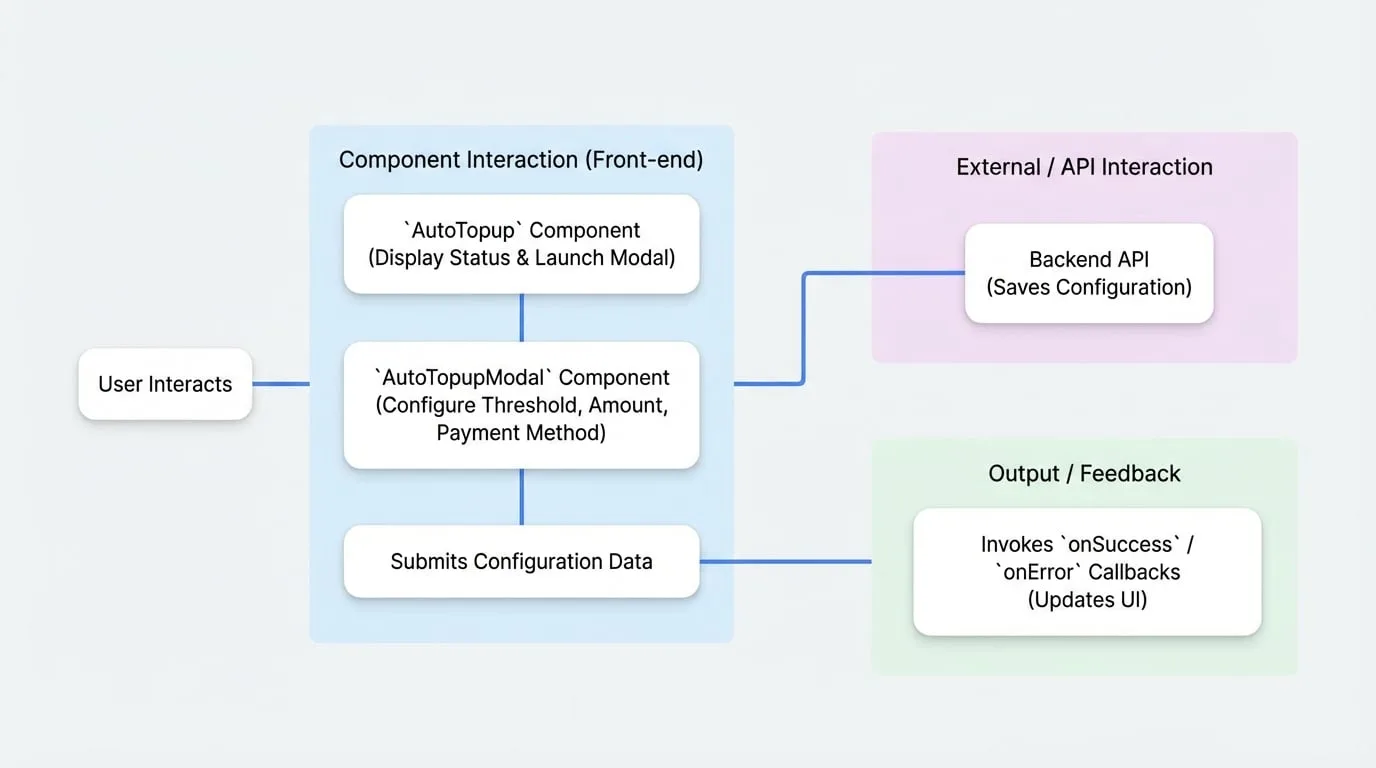
The diagram below illustrates the typical user flow for configuring the auto-topup feature. The user interacts with the AutoTopup display component, which launches the AutoTopupModal for making changes. The modal then communicates with the backend API to save the configuration.
AutoTopup
The AutoTopup component is a display card that shows the current auto-recharge status for a specific currency and provides an entry point for configuration. It supports multiple rendering modes for flexibility.
Props
| Prop | Type | Description |
|---|---|---|
currencyId | string | Required. The ID of the credit currency to manage. |
onConfigChange | (config: AutoRechargeConfig) => void | Optional. Callback function triggered when the configuration is successfully updated. |
mode | 'default' | 'simple' | 'custom' | Optional. The rendering mode. Defaults to 'default'. - default: A fully expanded card showing all details. - simple: A compact, collapsed view with a button to expand details. - custom: Renders a custom UI using the children render prop. |
sx | SxProps | Optional. Custom MUI styles to apply to the component. |
children | (openModal, config, paymentData, loading) => React.ReactNode | Optional. A render prop function used only when mode is 'custom'. It receives the tools needed to build a custom interface. |
Usage
Simple Mode
This is the most common use case, providing a compact display that users can expand for more details.
CreditManagement.tsx
import { PaymentProvider, AutoTopup } from '@blocklet/payment-react';

function CreditManagement({ session, currencyId }) {
  const handleConfigChange = (config) => {
    console.log('Auto-topup config updated:', config);
    // You might want to refresh the user's balance here
  };

  return (
    <PaymentProvider session={session}>
      <AutoTopup
        currencyId={currencyId}
        mode="simple"
        onConfigChange={handleConfigChange}
        sx={{ mt: 2 }}
      />
    </PaymentProvider>
  );
}
Custom Mode
For full control over the UI, use custom mode with a render prop. This allows you to integrate the auto-topup status and configuration trigger into your existing layout seamlessly.
CustomAutoTopupDisplay.tsx
import { PaymentProvider, AutoTopup } from '@blocklet/payment-react';
import { Button, Card, CardContent, Typography } from '@mui/material';

function CustomAutoTopupDisplay({ session, currencyId }) {
  return (
    <PaymentProvider session={session}>
      <AutoTopup currencyId={currencyId} mode="custom">
        {(openModal, config, paymentData, loading) => {
          if (loading) return <div>Loading configuration...</div>;

          return (
            <Card variant="outlined">
              <CardContent>
                <Typography variant="h6">Smart Auto-Recharge</Typography>
                {config?.enabled ? (
                  <Typography color="success.main">
                    Status: Active
                  </Typography>
                ) : (
                  <Typography color="text.secondary">
                    Status: Inactive
                  </Typography>
                )}
                <Button onClick={openModal} variant="contained" sx={{ mt: 2 }}>
                  {config?.enabled ? 'Modify Settings' : 'Setup Now'}
                </Button>
              </CardContent>
            </Card>
          );
        }}
      </AutoTopup>
    </PaymentProvider>
  );
}
AutoTopupModal
The AutoTopupModal is a dialog component that allows users to enable, disable, and configure all aspects of the auto-topup feature, including the trigger threshold, purchase amount, and payment method.
Props
| Prop | Type | Description |
|---|---|---|
open | boolean | Required. Controls whether the modal is visible. |
onClose | () => void | Required. Callback function to close the modal. |
currencyId | string | Required. The ID of the credit currency being configured. |
customerId | string | Optional. The customer's DID. Defaults to the user from the PaymentProvider session. |
onSuccess | (config: AutoRechargeConfig) => void | Optional. Callback triggered after the configuration is successfully saved. |
onError | (error: any) => void | Optional. Callback triggered if an error occurs during submission. |
defaultEnabled | boolean | Optional. If true, the 'Enable Auto-Topup' switch will be on by default when the modal opens for a new configuration. |
Usage
Here is a complete example of how to manage the AutoTopupModal's state and handle its callbacks.
AutoRechargeSettings.tsx
import { PaymentProvider, AutoTopupModal } from '@blocklet/payment-react';
import { useState } from 'react';
import { Button } from '@mui/material';

function AutoRechargeSettings({ session, currencyId }) {
  const [isModalOpen, setModalOpen] = useState(false);

  const handleSuccess = (config) => {
    console.log('Configuration saved successfully:', config);
    setModalOpen(false);
    // Optionally, show a success toast or refresh data
  };

  const handleError = (error) => {
    console.error('Failed to save configuration:', error);
    // Optionally, show an error message to the user
  };

  return (
    <PaymentProvider session={session}>
      <Button variant="contained" onClick={() => setModalOpen(true)}>
        Configure Auto-Recharge
      </Button>

      <AutoTopupModal
        open={isModalOpen}
        onClose={() => setModalOpen(false)}
        currencyId={currencyId}
        onSuccess={handleSuccess}
        onError={handleError}
        defaultEnabled={true}
      />
    </PaymentProvider>
  );
}
This setup provides a robust way to manage auto-recharge functionality, giving users control while ensuring a smooth experience for maintaining their service credits.