The ComponentInstaller is a utility component that acts as a gatekeeper for features that depend on other blocklets. It verifies whether specified component dependencies are installed. If they are not, it provides a user-friendly interface for administrators (owner or admin roles by default) to install them directly. If the user lacks the necessary permissions, it displays a message advising them to contact an administrator.
This component is essential for creating robust applications that can gracefully handle missing optional dependencies, improving the user experience by guiding administrators through the installation process.
How It Works
The component's logic follows a clear, sequential process to ensure dependencies are met before rendering its child components.
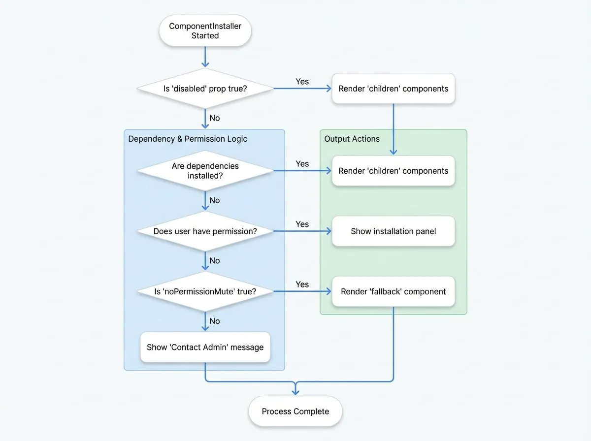
- Dependency Check: It reads the
didprop and checks against the blocklet's metadata (window.blocklet.optionalComponents) to determine if the required components are installed. - Permission Check: If any components are missing, it uses the
SessionPermissioncomponent to verify if the current user's role matches those specified in therolesprop. - Conditional Rendering:
- If all dependencies are installed, it renders its
children. - If dependencies are missing and the user has permission, it displays a pop-up installation panel.
- If dependencies are missing and the user lacks permission, it either shows a suggestion to contact an admin or renders a
fallbackcomponent ifnoPermissionMuteis enabled.
Basic Usage
Wrap any component or feature that relies on an optional blocklet with ComponentInstaller. Provide the DID of the required component.
"MyFeature.jsx"
import ComponentInstaller from '@arcblock/blocklet-ui-react/lib/ComponentInstaller';
import MyDependentComponent from './MyDependentComponent';

export default function MyFeature() {
  // Replace with the actual DID of the required component
  const requiredComponentDid = 'z8ia2427634f1e909a304e2b963715a18';

  return (
    <ComponentInstaller did={requiredComponentDid}>
      {/* This component will only be rendered if the dependency is met */}
      <MyDependentComponent />
    </ComponentInstaller>
  );
}
Props
The ComponentInstaller accepts the following props to customize its behavior.
- did
string | string[](required) — The DID (or an array of DIDs) of the component dependencies to check. This is the primary identifier for the blocklet(s) you need. - children
any(required) — The content to render once all dependencies are confirmed to be installed. Can be a standard React node or a render function. - roles
string[](default:["owner", "admin"]) — An array of user roles that are permitted to see the installation UI and install missing components. - fallback
React.ReactNode— A fallback component to display while checking for dependencies or when noPermissionMute is active for a user without installation rights. - noPermissionMute
boolean(default:false) — If true, users without permission will see the fallback component (or nothing) instead of the "contact admin" message. - disabled
boolean(default:false) — If true, the component bypasses all checks and immediately renders its children. - onInstalled
function— A callback function that is triggered after the dependency check is complete. It receives the list of installed components. - onError
function— A callback function that is triggered if an error occurs during the dependency check. It receives the list of components that caused the error. - onClose
function— A callback function invoked when the installation pop-up is closed. - closeByOutSize
boolean(default:false) — If true, the installation pop-up will close when the user clicks outside of it. - warnIcon
React.ReactNode— A custom React node to replace the default warning icon in the installation pop-up.
Advanced Usage
Checking Multiple Components
You can pass an array of DIDs to the did prop to check for multiple dependencies at once. The children will only render if all specified components are installed.
"MyDashboard.jsx"
import ComponentInstaller from '@arcblock/blocklet-ui-react/lib/ComponentInstaller';
import AnalyticsWidget from './AnalyticsWidget';
import CmsWidget from './CmsWidget';

export default function MyDashboard() {
  const requiredDids = [
    'z8ia2427634f1e909a304e2b963715a18', // Analytics Service
    'z8ia3c1f2e4b8e6a1b2c3d4e5f6a7b8c9', // CMS Service
  ];

  return (
    <ComponentInstaller did={requiredDids}>
      <AnalyticsWidget />
      <CmsWidget />
    </ComponentInstaller>
  );
}
Using a Fallback for Loading States
Provide a fallback component to improve the user experience while the dependency check is in progress. This is also useful with noPermissionMute to display a placeholder for unauthorized users.
"FeatureWithLoading.jsx"
import ComponentInstaller from '@arcblock/blocklet-ui-react/lib/ComponentInstaller';
import CircularProgress from '@mui/material/CircularProgress';
import Box from '@mui/material/Box';
import MyDependentComponent from './MyDependentComponent';

export default function FeatureWithLoading() {
  const LoadingSpinner = (
    <Box sx={{ display: 'flex', justifyContent: 'center', p: 4 }}>
      <CircularProgress />
    </Box>
  );

  return (
    <ComponentInstaller
      did="z8ia2427634f1e909a304e2b963715a18"
      fallback={LoadingSpinner}
      noPermissionMute={true}
    >
      <MyDependentComponent />
    </ComponentInstaller>
  );
}
Custom UI with Render Props
For full control over the UI, you can pass a function as children. This function receives an object with hasPermission, optComponents, and installStatus, allowing you to build a completely custom installation interface.
"CustomInstallerButton.jsx"
import ComponentInstaller from '@arcblock/blocklet-ui-react/lib/ComponentInstaller';
import Button from '@mui/material/Button';

export default function CustomInstallerButton() {
  const requiredDid = 'z8ia2427634f1e909a304e2b963715a18';

  return (
    <ComponentInstaller did={requiredDid}>
      {({ hasPermission, optComponents, installStatus }) => {
        const isMissing = optComponents.length > 0;
        const status = installStatus[requiredDid] || 'not_installed';

        if (!isMissing) {
          return <p>Feature is ready to use!</p>;
        }

        if (!hasPermission) {
          return <p>Please ask an admin to install the required component.</p>;
        }

        return (
          <Button
            variant="contained"
            disabled={status !== 'not_installed'}
            onClick={() => window.open(optComponents[0].installUrl, '_blank')}
          >
            {status === 'not_installed' ? `Install ${optComponents[0].meta.title}` : `Installing... (${status})`}
          </Button>
        );
      }}
    </ComponentInstaller>
  );
}
Summary
The ComponentInstaller is a powerful component for managing optional dependencies within a blocklet application. It provides a structured and user-friendly way to ensure that required components are available, guiding administrators through the installation process when necessary. By using this component, you can build more resilient and feature-rich applications that adapt to the user's environment.
For further details on managing components, you may also be interested in the BlockletStudio component, which offers a more comprehensive interface for resource and component management.